Reclamation Etchworks
Logo Design
A custom laser etching boutique commissioned me to design their logo and identity. The aim was to capture the feeling of something industrial, elegant, crafty and precise.
A custom laser etching boutique commissioned me to design their logo and identity. The aim was to capture the feeling of something industrial, elegant, crafty and precise.
A custom laser etching boutique commissioned me to design their logo and identity. The aim was to capture the feeling of something industrial, elegant, crafty and precise.
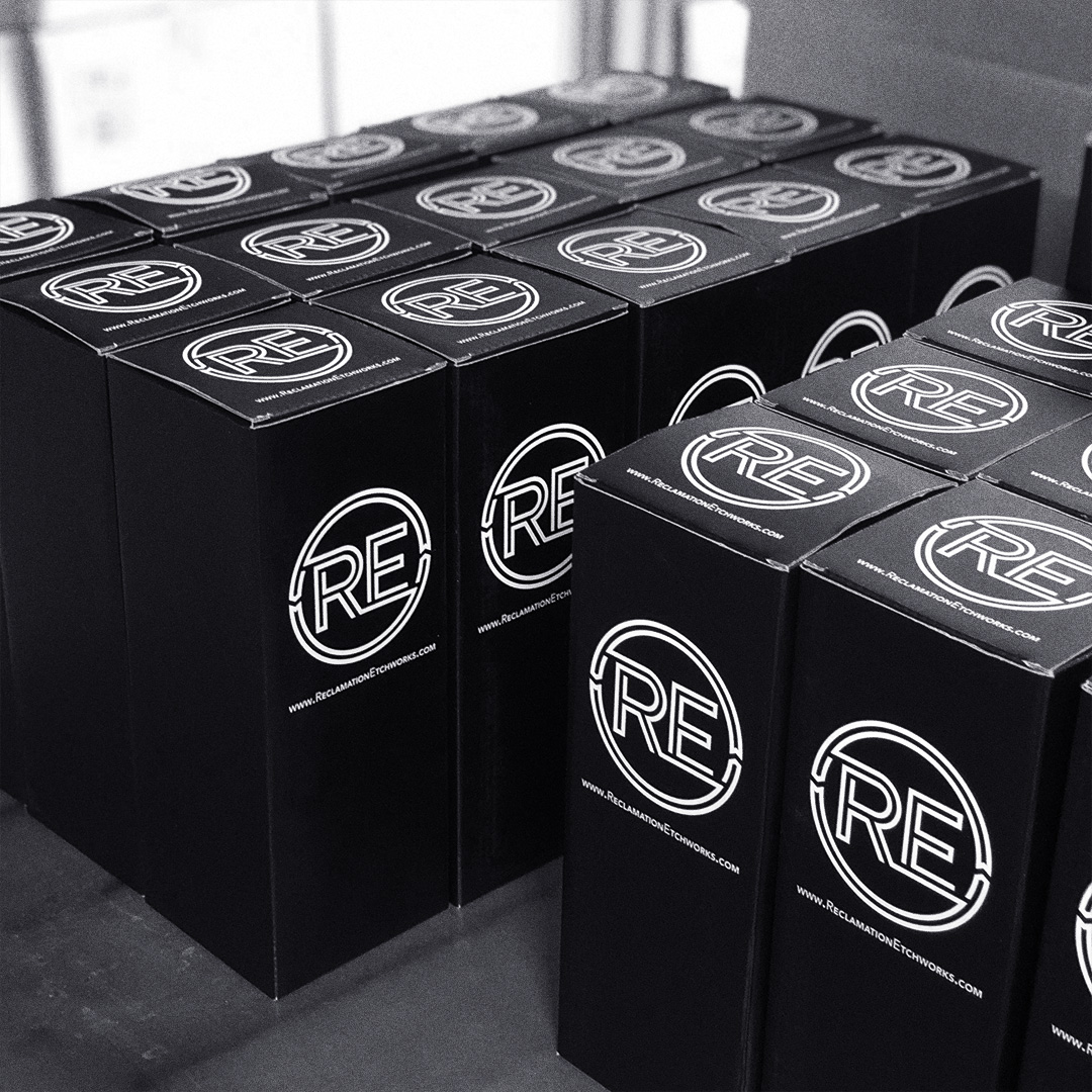
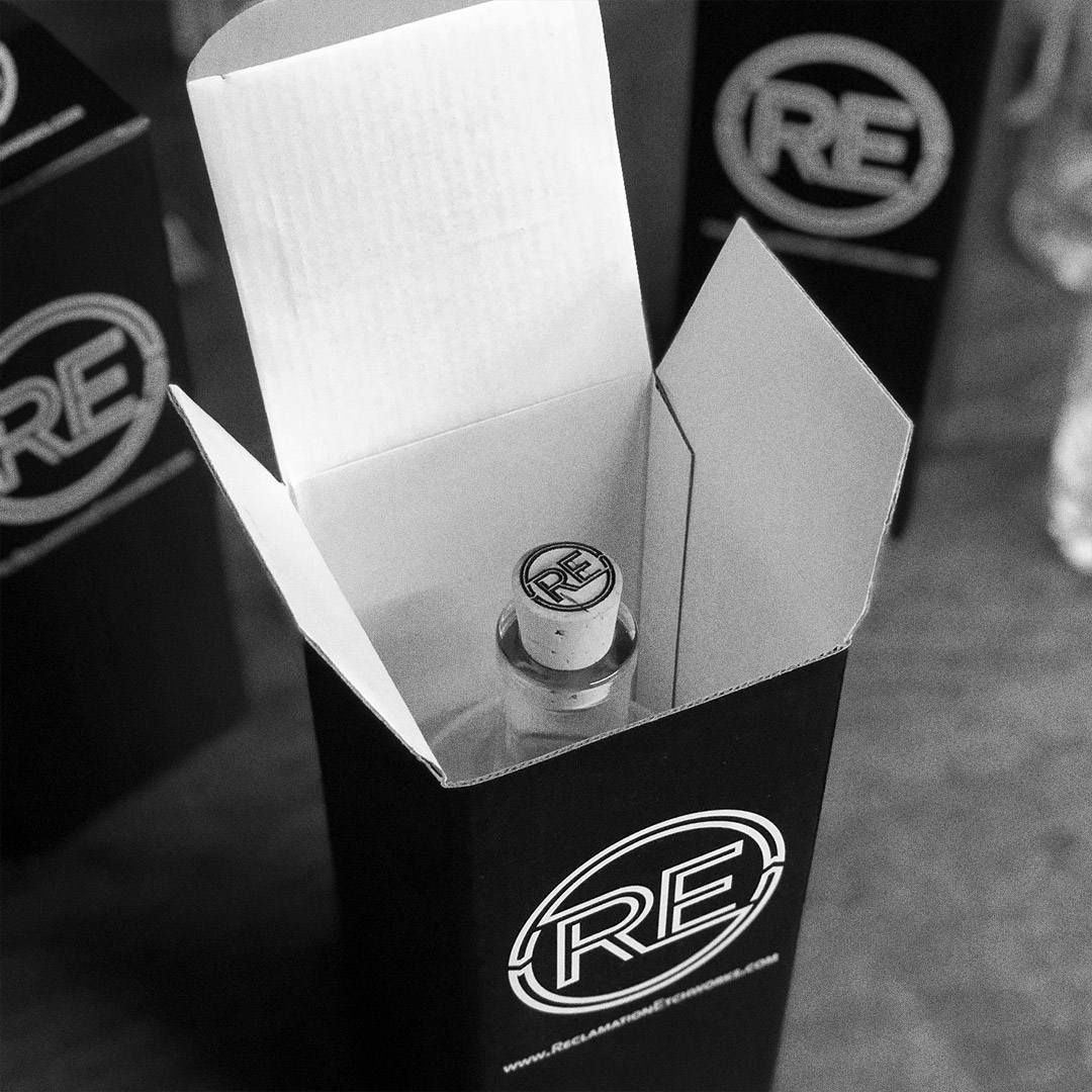
Reclamation Etchworks » in Santa Rosa, California specializes in custom etched decanter sets. Founders Tim Daw and Ethan Terry leveraged their connections to the Bay Area bar and restaurant scene to collect used liquor bottles and give them a new life as collectables and keepsakes adorned with ornate etched patterns and labels.
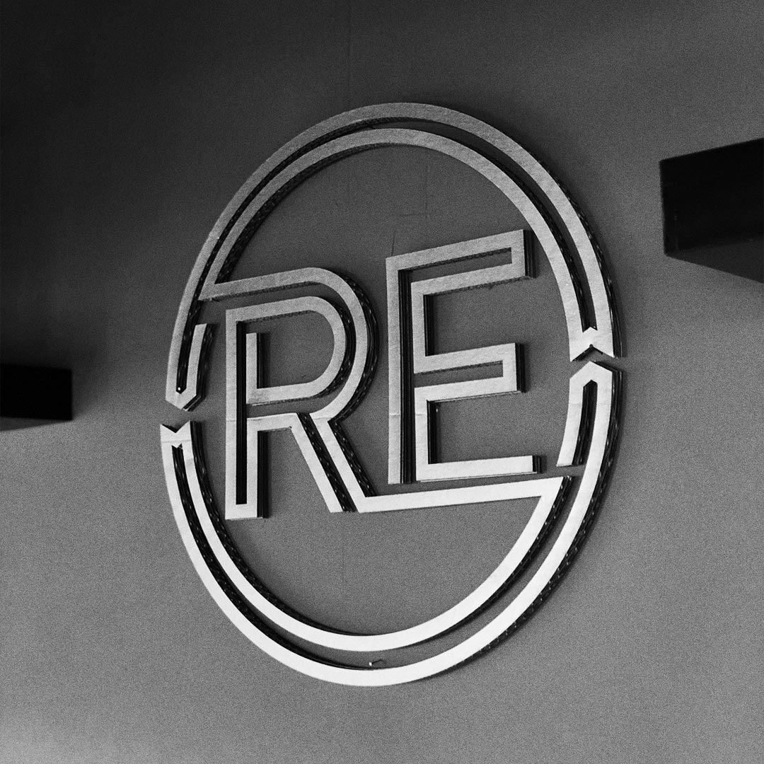
I decided to incorporate a visual reference to recycling as well as an inline motif that invoked a precision etched pattern. This logo had to suggest dimension, the kind that compels you to run a finger over a subtle but distinct engraved line. Above all, I wanted to give my clients a logo that cried out to be etched with a laser.
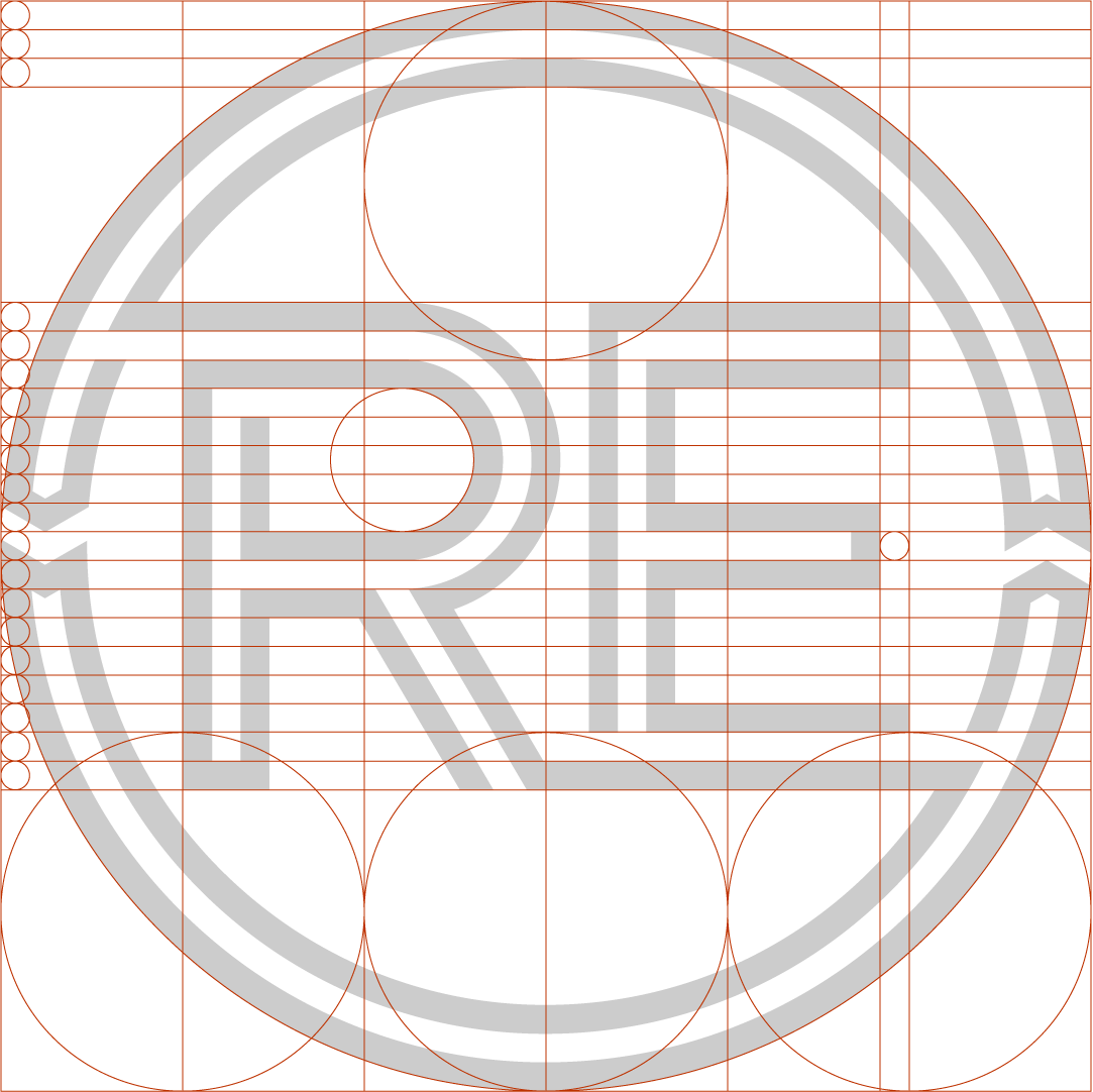
The entire icon is composed of only three lines. The main line comprises the encircling shape, its terminals at both of the circular arrows, and crosses over through both the letters R and E. One additional line each fills out the R and E. It was important for the logo to feel ornate and yet remain economical in its components.
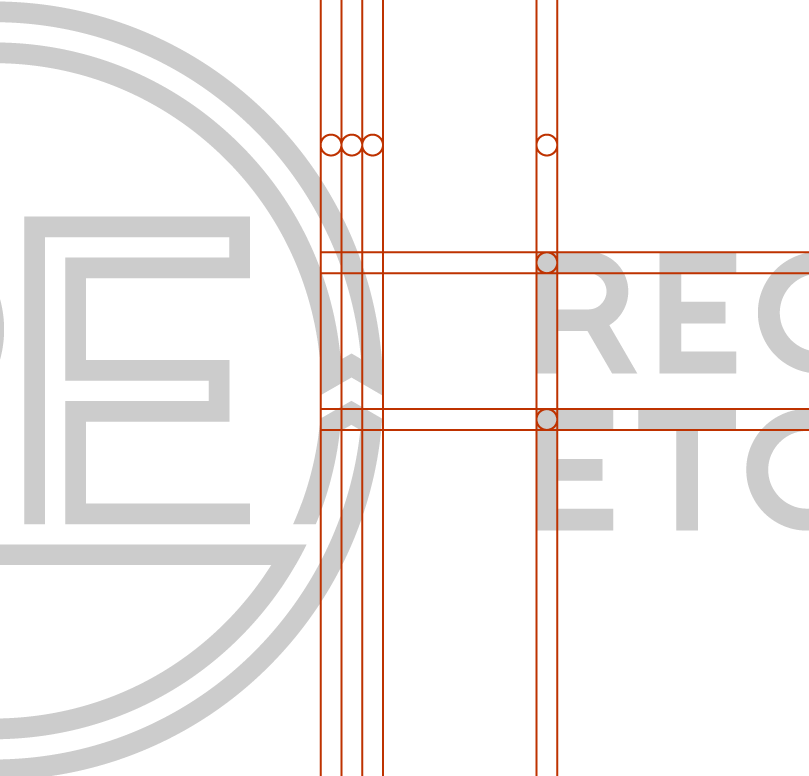
The wordmark, set in CWG Sans, was sized to match the stroke width to the strokes in the icon, maintaining a consistent single lineweight throughout all elements of the full logo.
Type
Type
Type
Type
© Casimir Fornalski 2010 – 2024
© Casimir Fornalski 2010 – 2021
